
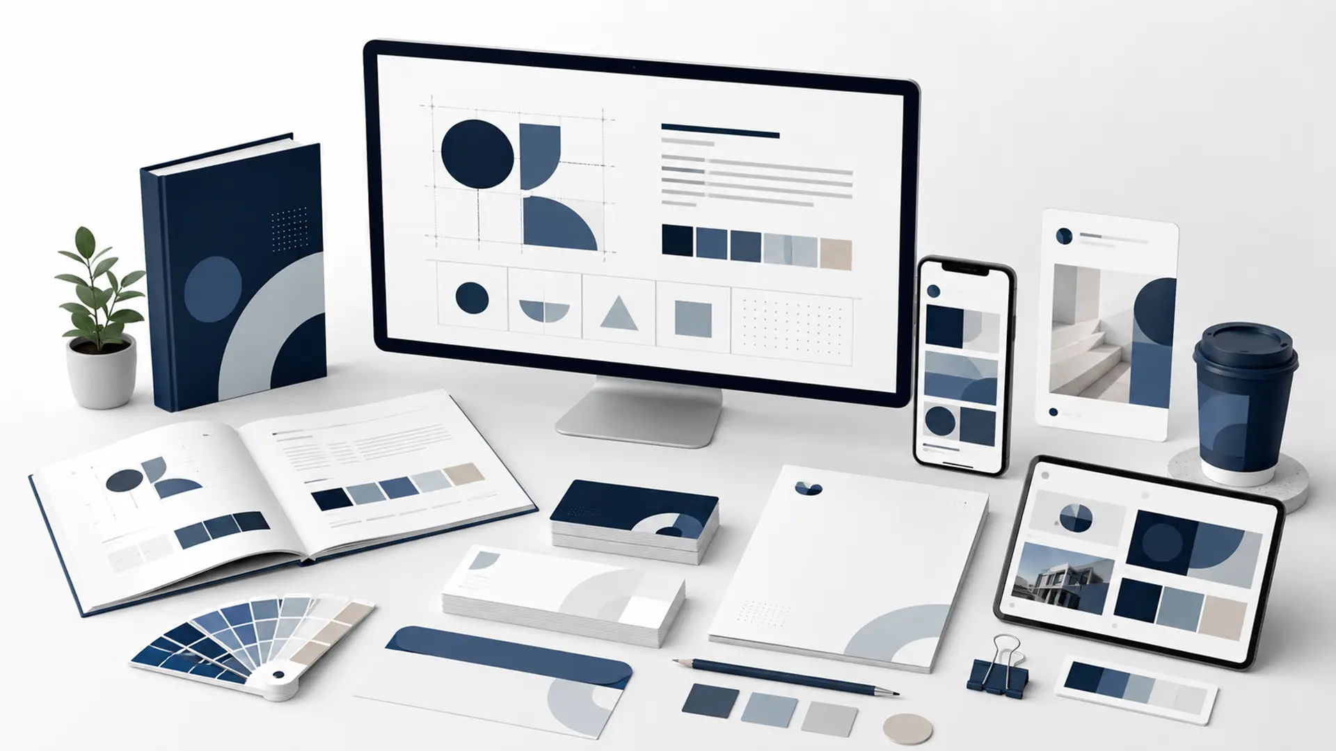
Corporate identity is the visual and communication system that defines how a business presents itself to customers, employees and business partners. A logo is an important part of that system, but corporate identity is much broader than a logo alone. Color, typography, icons, image treatment, document layouts, digital interfaces and the way the brand appears across different channels all belong to the same system.
The purpose of a well-designed corporate identity is not to make every design look identical, but to preserve the same brand character across different touchpoints. From a website and social media post to a proposal document or business card, people should experience clear visual continuity whenever they encounter the brand.
Corporate identity should therefore be approached not simply as a request for a good-looking logo, but as the creation of a design system the brand can use consistently over the long term.
What Is Corporate Identity?
Corporate identity is the set of rules that defines how a brand is recognized visually and represented across different applications. It brings the logo, color palette, typefaces and graphic elements together under a shared visual language.
A corporate identity prevents work produced by different people from looking disconnected. Instead of the website, social media and proposal documents appearing to belong to different brands, every channel carries the same visual character.
This becomes increasingly important as the business grows. Once design work is no longer handled by a single person and different teams or partners begin working with the brand, documented standards help preserve consistency.
Why Is Corporate Identity Important?
When people first encounter a business, they evaluate not only the service being offered but also how the brand presents itself. A consistent and carefully designed visual system can strengthen professional perception, while fragmented use can weaken trust regardless of service quality.
- Makes the brand easier to recognize across different channels.
- Creates visual consistency across web, social media and printed materials.
- Avoids repeatedly making the same fundamental design decisions.
- Provides shared standards for new team members and external partners.
- Helps the brand develop a more distinctive character than its competitors.
- Makes design production faster and more controlled over the long term.
The value of corporate identity is not purely aesthetic. A well-defined system is also a practical tool that saves time in day-to-day design and communication work.
What Does Corporate Identity Include?
The scope of corporate identity can vary depending on the size of the business and where the brand will be used. Not every brand needs dozens of documents, but the core system should be flexible enough to support future channels and applications.
| Corporate Identity Element | Primary Function |
|---|---|
| Logo and variations | Defines the brand’s primary visual mark and its approved variations. |
| Color palette | Defines primary, supporting and, when needed, accent colors. |
| Typography | Defines typefaces for headings, body copy and different media. |
| Icon and graphic language | Creates a consistent style across supporting visual elements. |
| Photography and illustration direction | Guides the overall character and selection of imagery. |
| Digital applications | Maintains brand consistency across websites, social media and digital advertising. |
| Printed materials | Standardizes business cards, letterheads, folders, catalogs and similar applications. |
| Brand guidelines | Brings implementation rules for all these decisions into one reference document. |
Depending on business needs, corporate identity can also cover packaging, vehicle graphics, in-store signage, presentation templates, email signatures and event materials.
Are a Logo and Corporate Identity the Same Thing?
No. A logo is one of the central visual elements of corporate identity, but it does not create a complete identity on its own. Designing only the logo without defining color, typography and usage rules can lead to inconsistent results in later work.
Brand consistency quickly breaks down when the same logo is used with unrelated typefaces, arbitrary colors or constantly changing visual styles. Corporate identity reduces this problem by defining the system in which the logo should be used.
Bu nedenle graphic design and corporate identity projects, treating the logo as part of the wider visual system rather than as an isolated file leads to more consistent results.
How Should a Brand Color Palette Be Defined?
Brand colors should not be selected simply because a designer likes certain shades. The brand’s character, industry, audience, need for differentiation and digital usage conditions should all be considered together.
A typical system defines a primary color, supporting colors and, when necessary, accent colors. Digital interfaces may also require systematic choices for text, backgrounds, errors, success states and notifications.
- The primary color should represent the brand clearly and consistently.
- Color combinations should provide sufficient contrast.
- Readability should be maintained across web and mobile interfaces.
- Color reproduction in printed materials should be predictable.
- Too many primary colors should not weaken the visual hierarchy.
Defining HEX, RGB, CMYK and, when needed, Pantone values reduces inconsistencies during implementation.
Why Is Typography Selection Important?
Typography is one of the main components that visually carries the brand’s voice in written communication. The same message can create a very different impression when set in different typefaces, so fonts should be selected for readability and practical use as well as aesthetics.
A corporate identity system can define typefaces for main headings, subheadings and body copy, along with weights and a basic typographic hierarchy. For digital use, web performance, character support and licensing terms should also be evaluated.
For brands publishing in Turkish, it is important to verify that the selected typeface fully supports Turkish-specific characters across all required weights.
How Do You Build a Visual Language and Design System?
An important part of corporate identity beyond logo, color and typography is the visual language. Icon style, photography direction, illustration style, corner radii, line weights and the overall treatment of graphic elements all contribute to this language.
For example, if a brand has a minimalist and technical character, heavily decorative social media designs or a completely different illustration style on the website can weaken consistency. At the same time, every piece of work does not need to look identical.
A well-designed system allows creative flexibility while still making it clear that different pieces of content belong to the same brand.
How Is Corporate Identity Adapted to Digital Channels?
Corporate identity can no longer be designed only for business cards and letterheads. Websites, social media, mobile interfaces, email, digital advertising and presentations are among the most frequent customer touchpoints for many brands.
The identity system therefore needs to work across different screen sizes. The project should consider whether the logo remains readable at small sizes, whether colors provide accessible contrast, whether fonts render efficiently on the web and whether the design system adapts well to different social media formats.
In web design, corporate identity is not simply about applying brand colors to a website. Buttons, card components, icons, imagery, typographic hierarchy and spacing all form part of the brand’s digital expression.
How Do You Maintain Consistency in Printed Materials?
Corporate identity should preserve the same visual logic in printed materials. Business cards, folders, letterheads, envelopes, catalogs and brochures may serve different purposes, but color, typography, logo clear space and overall design character should remain consistent.
A color or fine line that looks correct on screen may not reproduce the same way in print. Print applications therefore require separate consideration of color profiles, paper type, minimum logo size and production techniques.
Not every brand needs every printed application at the beginning. It is more efficient to focus on materials the business will actually use rather than producing dozens of unnecessary mockups.
What Is a Corporate Identity Guide?
A corporate identity guide, or brand guidelines document, explains how the visual system should be applied. It keeps design decisions from existing only in a designer’s head and creates a shared reference for everyone working with the brand.
- Logo variations and clear-space rules,
- Examples of incorrect logo usage,
- Corporate color values,
- Typography and text hierarchy,
- Icon and imagery principles,
- Background and contrast rules,
- Examples of digital and print applications may all be included in the guidelines.
The guide does not need to be dozens of pages long. What matters is that it clearly defines the decisions people need to make during real-world use.
When Should Corporate Identity Be Updated?
Brands do not need to refresh their corporate identity every time design trends change. The purpose of a strong identity is to create a consistent system that can be used for years.
A refresh may become necessary when the business positioning changes, the target audience expands, the existing design no longer works well across digital channels or years of uncontrolled use have weakened visual consistency.
- If the logo cannot be used effectively across different media,
- If the brand now addresses a different target audience,
- If the color and typography system has become inconsistent,
- If there is no adequate design system for digital interfaces,
- If the brand’s positioning has changed significantly, an identity update may be worth considering.
A refresh does not always mean discarding everything. Strong, recognizable elements can be retained while the rest of the system is updated for modern usage needs.
How Does the Corporate Identity Design Process Work?
A strong corporate identity project does not begin by drawing a logo immediately. First, the business needs to be understood: what it does, who it serves, how it differs from competitors and what kind of perception it wants to create.
- Brand and needs analysis: The business area, target audience and intended channels are defined.
- Visual direction: A design direction is developed for color, typography, form and overall style.
- Logo and core system: Logo variations and the main visual identity components are created.
- Applications: Digital and print examples are prepared based on real usage needs.
- Standards: Usage rules for the logo, color, typography and other elements are defined.
- Delivery and continuity: Required files and brand guidelines are organized and delivered for ongoing use.
The scope will not be the same for a small business and a brand managing many channels and products. What matters is defining the project around actual usage requirements.
What Should You Consider When Commissioning Corporate Identity Work?
When comparing corporate identity services, focusing only on the number of design files delivered can be misleading. What matters is whether the resulting system works in the business’s real usage scenarios.
- Is the brand and target audience analyzed before design work begins?
- Can the logo work across different sizes and backgrounds?
- Are color and typography rules clearly defined?
- Are digital usage scenarios considered?
- Are licensing terms clear for delivered fonts, images and other assets?
- Are vector files and required production files included?
- Is there a guide that another designer can understand if they take over the brand later?
At Webrote, we plan graphic design requirements with specialist creative partners according to project scope and focus on ensuring that the resulting identity works consistently across web, marketing and other digital processes.
Frequently Asked Questions About Corporate Identity
When planning a corporate identity project, similar questions often arise around logos, brand guidelines, color usage and refreshes. Below, we answer the most common questions to clarify before the project begins.
Is Corporate Identity Just Logo Design?
No. A logo is a core part of corporate identity, but the color palette, typography, visual language, digital and print applications, and usage standards are also part of the identity system.
Does Every Business Need a Corporate Identity Guide?
The scope can vary by business, but documenting basic logo, color and typography rules is useful for most brands. A guide becomes especially important when several people or teams produce design work.
How Long Does It Take to Create a Corporate Identity?
Timing depends on research, whether a new logo is required, the number of applications and the scope of revisions. A basic identity system and a comprehensive project with many digital and print applications will not take the same amount of time.
Can Corporate Identity Be Refreshed While Keeping the Existing Logo?
Yes. If the logo is strong and recognizable, it does not need to be replaced completely. The existing identity can be refreshed by improving color, typography, usage rules and the digital design system.
How Is Corporate Identity Applied to a Website?
Beyond using the logo and colors, typographic hierarchy, buttons, icons, card components, image choices, spacing and interface components create the digital expression of the corporate identity.
Strong Corporate Identity Is About Much More Than Appearance
Corporate identity is not created simply to make a brand look better. The right system helps the business maintain the same character across different touchpoints, speed up design production and make the brand easier for customers to recognize.
When the logo, color, typography, visual language and application standards work together, the result is a more consistent brand experience across websites, social media, advertising and printed materials.
If you want to create a new brand identity or make your existing visual system more consistent, you can explore our Graphic Design services or tell us about your project.
Leave a Reply